AT&T UBAM
web application | ENTERPRISE | APR 2018

Problem + Solution
AT&T was to sunset a 15+ year old JAVA app that allowed their employees to manage enterprise billing accounts totaling $23 billion in revenue YOY. This old system was causing productivity issues due to its slow processing and "horrible" interface. I redesigned and assisted in the launch of a new application that allowed users to do a number of new tasks while also replicating key functionality from the old app. The UBAM (Unified Billing Account Management) app was designed entirely as a collaboration between the design team and the users resulting in an efficient, scalable, and most importantly an easy-to-use application.
ROLE + Responsibilities
Lead UX Designer
Design Thinking Workshops, Research, Information Architecture, Interaction Design, Lo-Fi and Mid-Fi Wireframing, Prototyping, Documentation + Transfer of Design Assets, Design Sprint Management (Agile)
Collaborated with Visual Designer, Front End Developers, Sr. Business Analyst/Scrum Master, AT&T Product Owners, AT&T EUAM/UBAM Users, IBM Developers + System Engineers
Tools
Pen + Paper
Whiteboard
Post-its
Omnigraffle
Sketch
Sympli
Mural
InVision
Axure
Process

While being briefed on the project and client, the project lead turned to me asked, "So, what is your plan for design?" This was this team's first time working with a UX designer. So I had to set precedent on how exactly design was gong to play into the project. There were lots of learning experiences but I eventually established this process in order to successfully deliver a user centric, user advocated, stakeholder satisfying product.
research
Design thinking workshop
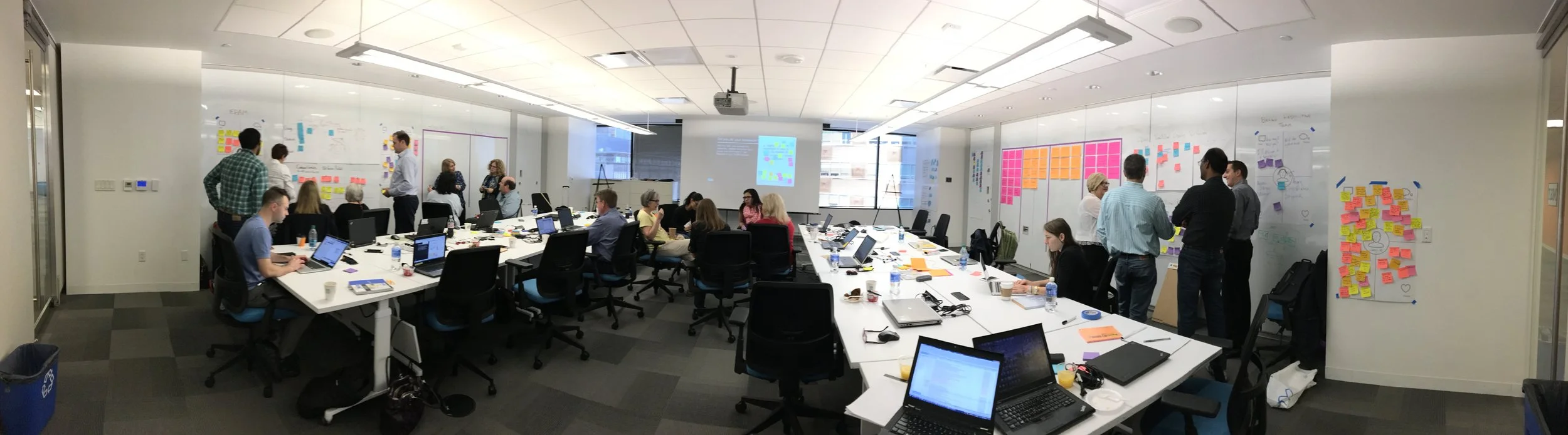
I co-facilitated an IBM Design Thinking workshop that brought together key groups required in redesigning the application. They included myself and the IBM IX team, AT&T Product Owners, IBM System Engineers, and most importantly key users from 4 different user groups (8000+ users) that will be using the new AT&T app. Activities included:
PERSONA DEFINITION - Created empathy maps for these personas
AS-IS SCENARIO MAP - Identifies pain points
TO-BE SCENARIO MAP - Derive possible solutions and process changes from pain points. Transform those into goals.
BUSINESS GOALS - Prioritize goals into a road map
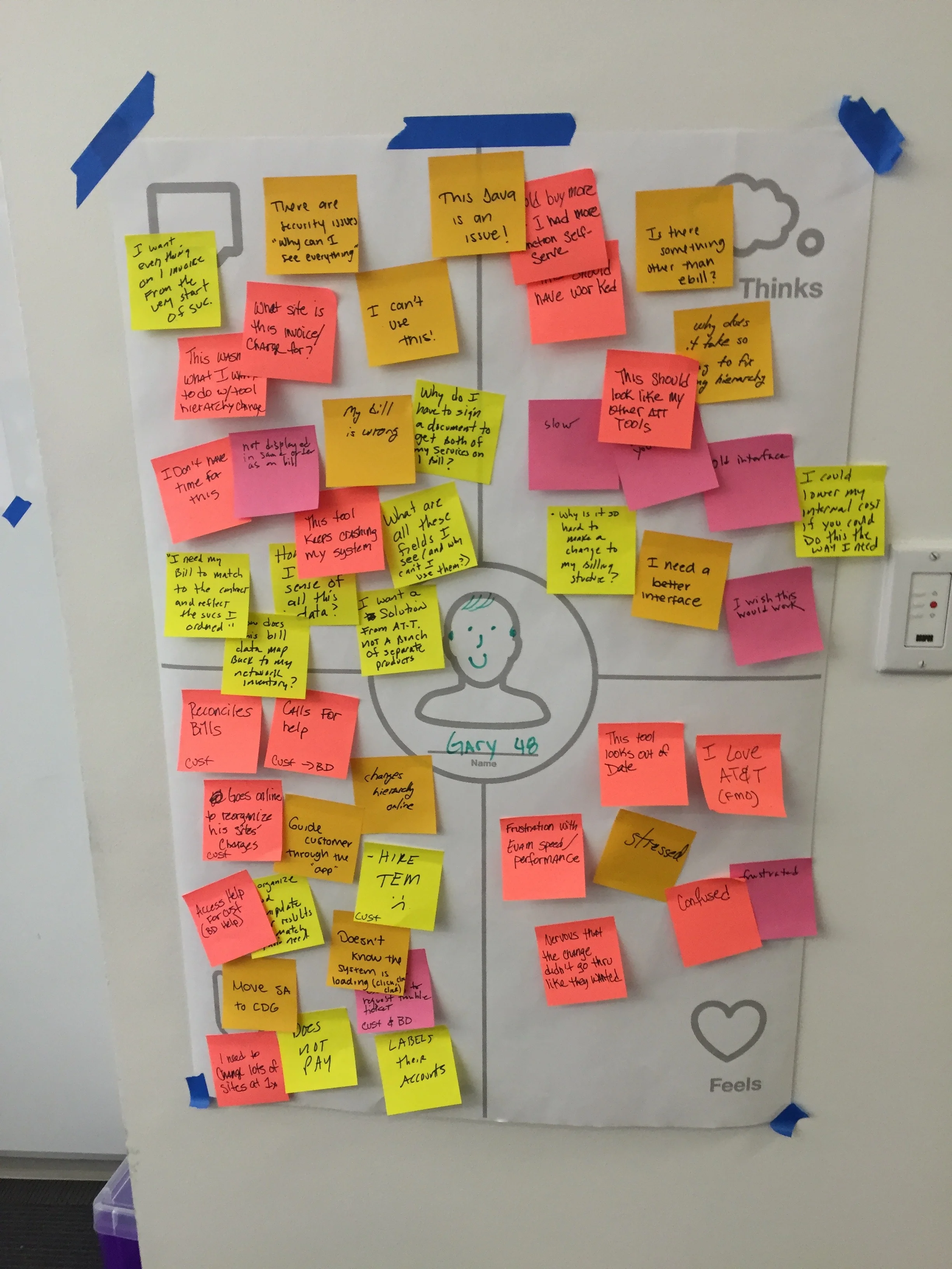
PERSONA CREATION
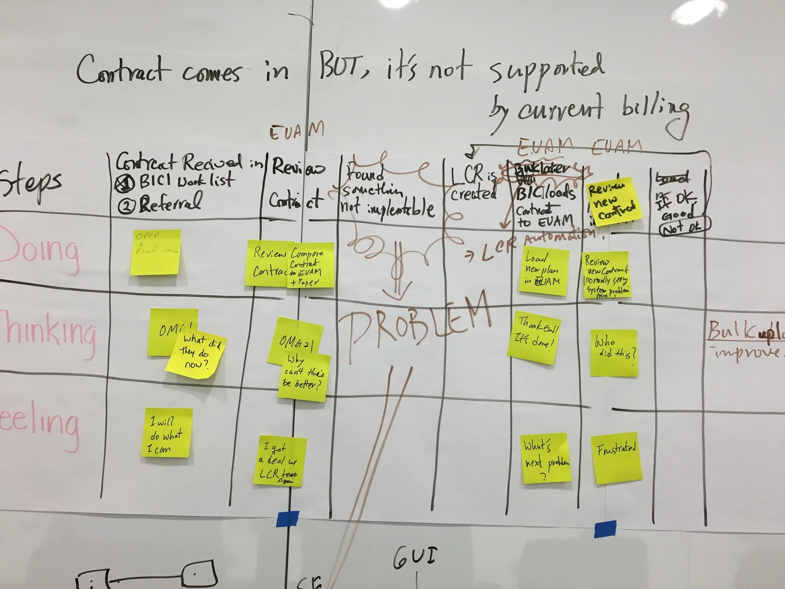
AS-IS SCENARIO MAPPING
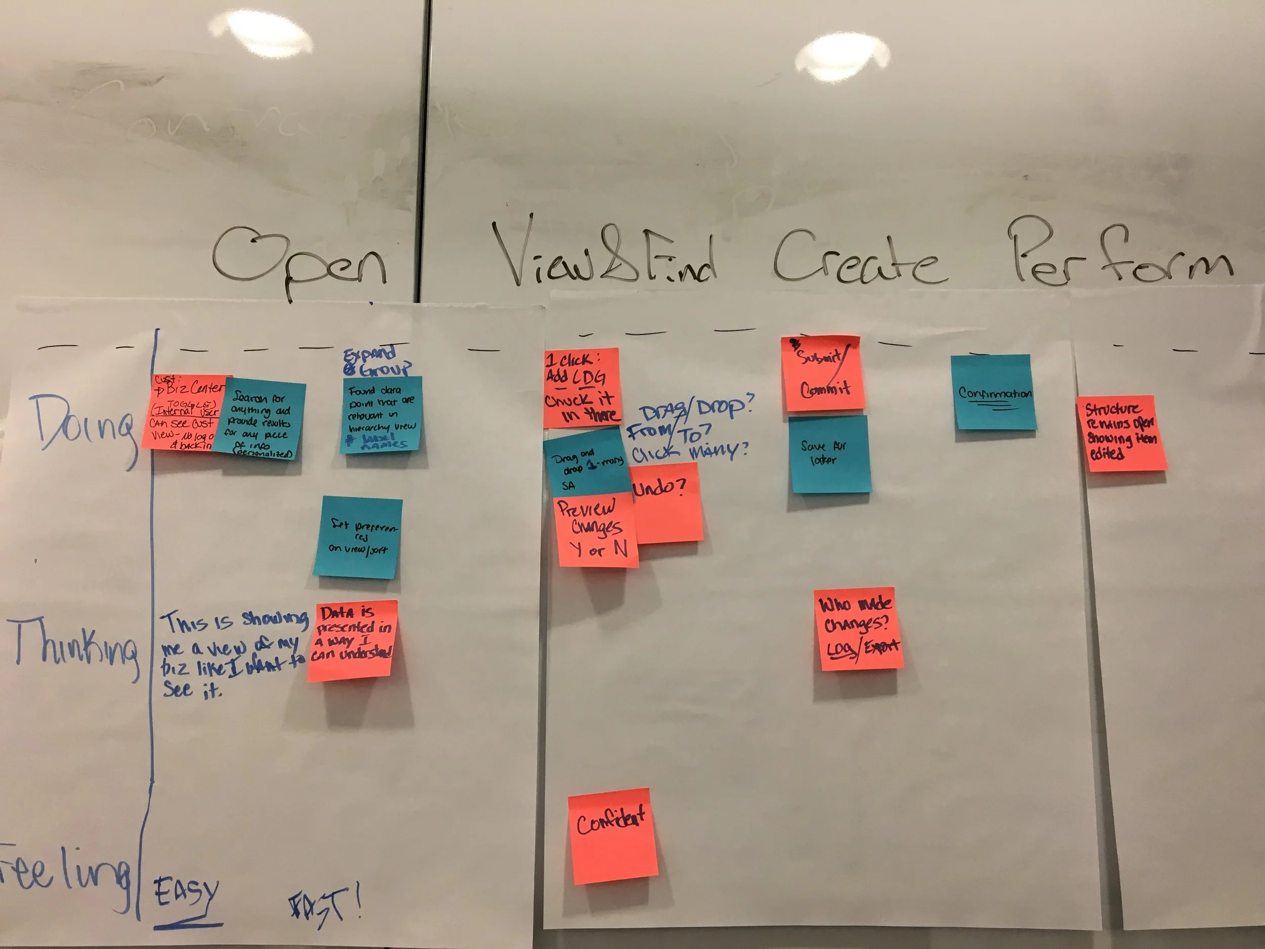
TO-BE SCENARIO MAPPING
BUESINESS GOAL PRIORITIZATION
Heuristics of EUAM
contextual inquiry
After walking through the application with various users, I found that the main issues were performance, stability, not intuitive, too many clicks, steps, information overload/busy, cumbersome user interface for simple tasks, and no automation.
"EUAM does not even have a simple search" - User
Strategy
AFFITINITY DIAGRAMMING
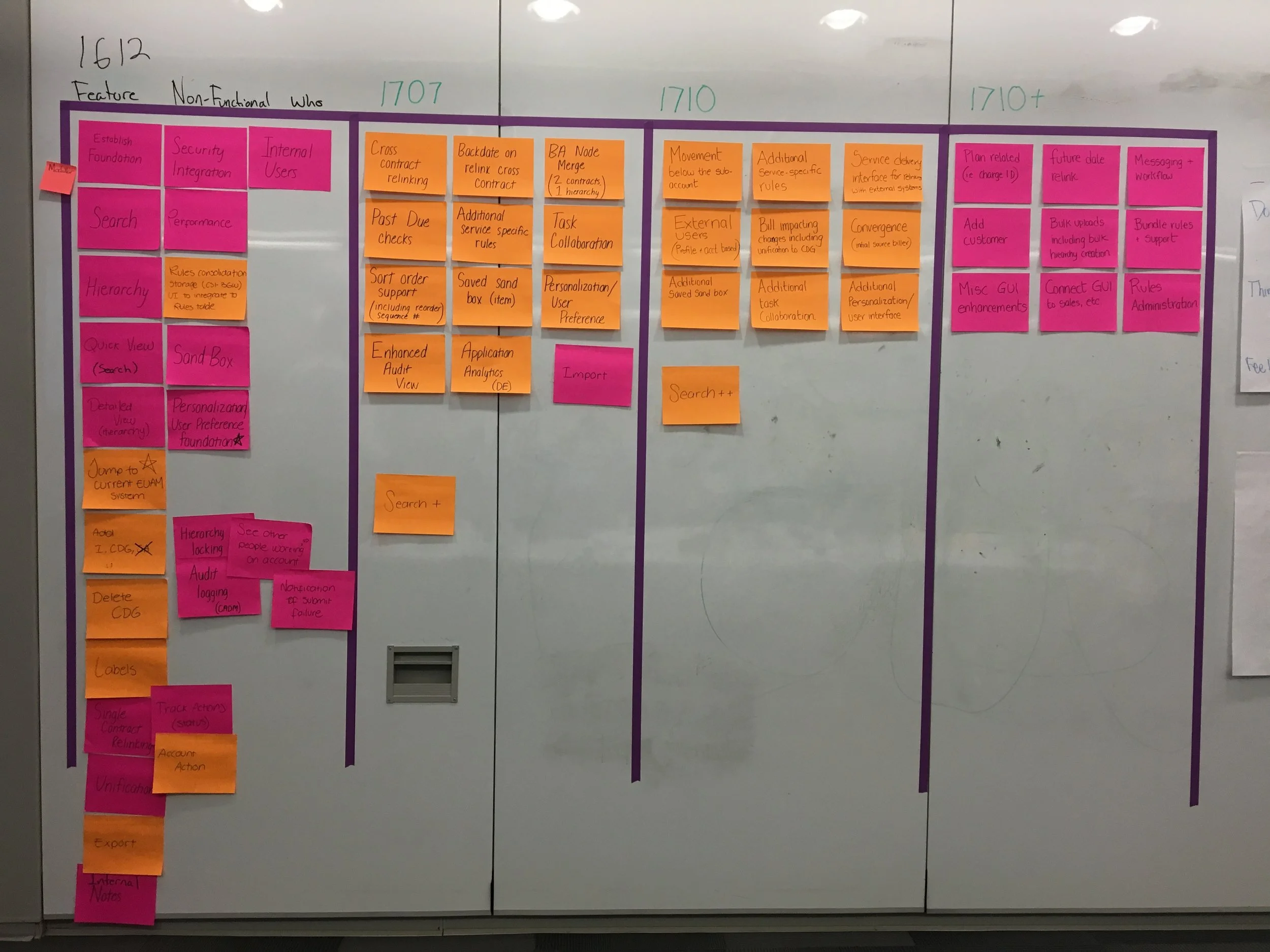
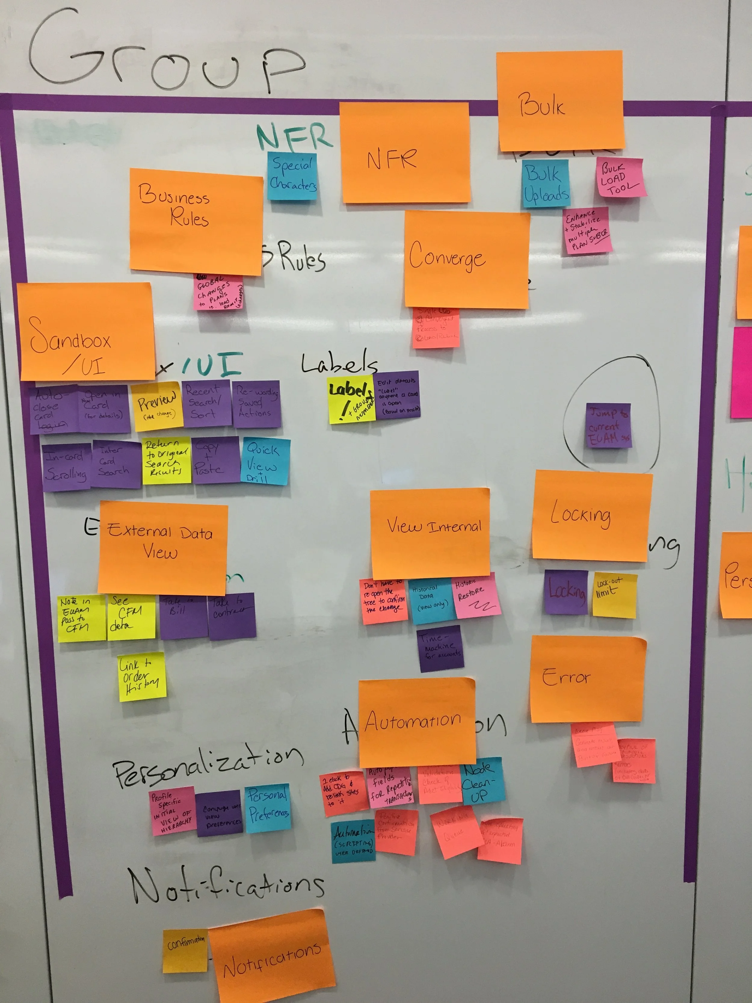
I worked with an IBM IX System Architect to map out all the features and data points in the current system to then conduct an activity with the users and stakeholders. The data points were organized into buckets that were all attached to a business goal identified in the workshop. Major themes that emerged from this exercise were: Status, Search, Work/Process, and Preferences.
Sitemap
Using those key words, features, and new capabilities that were organized in the Affinity Diagramming exercise, I designed this sitemap displayed to the right. Major "buckets" transformed into features we decided to call: Dashboard (some sort of overview page for transaction status and saved work in progress), Workspace (used to be called a sandbox- where user did work, processed transactions), and Search (Simplified search with multi-layered options) This map became the foundation or "skeleton" to the framework of the new UBAM app.
User flows
With the sitemap as guidance, I created flows that show the new process for achieving the goals the users help set in the workshop. The "User Design Review" sessions started at this point in the design process. These meetings were used to present to users and stakeholders the flows, and then allow for discussion and feedback. The design team consisting of myself, a BA and a visual designer, would then make appropriate changes and re-present our designs/flows for approval.
DESIGN
LO-Fi Wireframes
I used a paper and pencil to rapidly sketch a few design flows that addressed the high level capabilities as described by a user below:
"Needs to be able to search for accounts, view status, and open and work on multiple accounts at once" - AT&T user
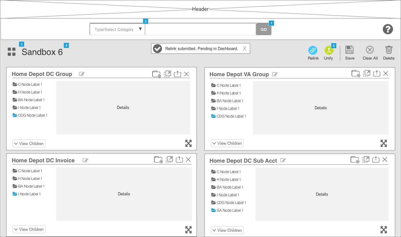
I used "cards" as a major element in the framework because they solved for requirements like being able to see more than one account at a time, and allowed for minimization of data overload. Performance. They presented least amount of data needed for the user to do work and then some when expanded. Provided flexibility.
The IBM Visual Designer and I, then finalized on two lo-fi flow options that we circulated internally for agreement from the business and the developers that the interaction modal we were thinking of was feasible.
MID-FI wireframes
I took the finalized sketches and had my Visual Designer digitize them to review with client. Then we conducted another "User Design Review" session with users and client product owners to get feedback on design direction.
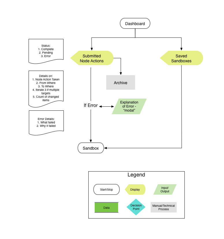
DASHBOARD: landing page with "Search", "Submitted transactions in progress," "Saved work in progress," and "Preferences." (All the users did not have in the previous app.)
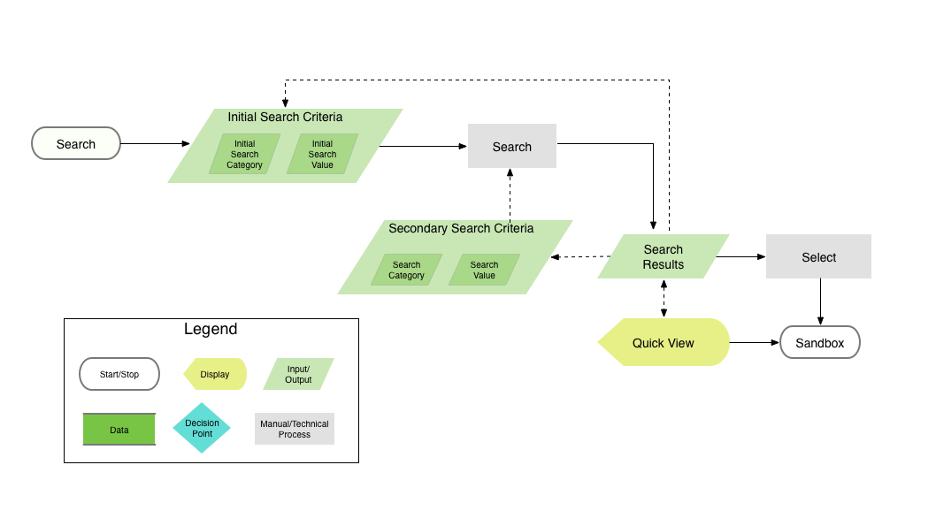
SEARCH: Ability to select "Category" to search, "Search results", "Quick view" before opening account in workspace.
WORKSPACE: "Search", "Cards" (accounts), and "Account action menu."
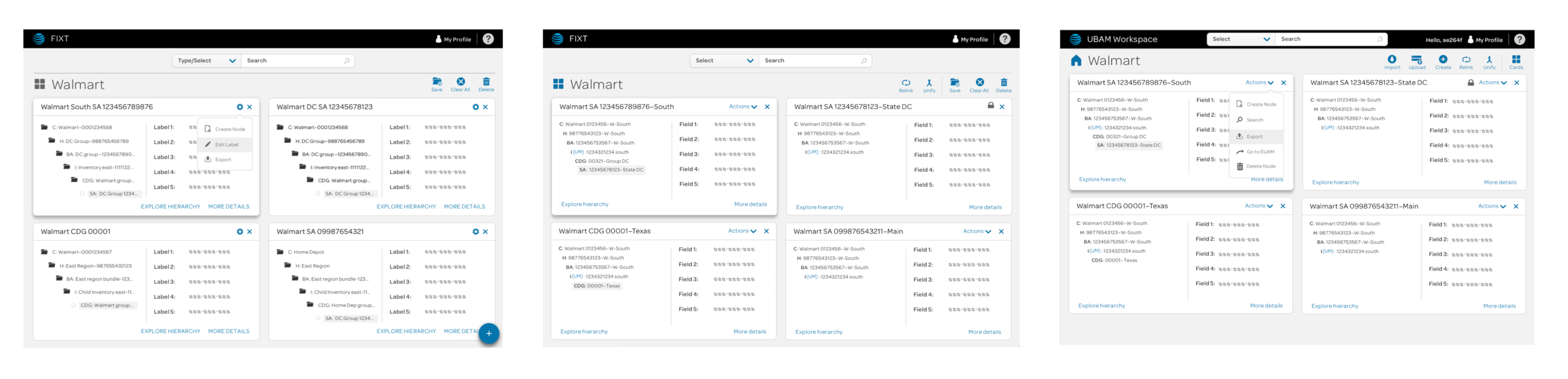
Use of Prototypes + Hi-fidelity iterations
In order for the entire team to understand the interaction framework I was building for this application, I used to prototype the screens using Axure. I presented these small prototypes for various interactions in the app to the main dev team to check for feasibility and then at the "User Design Sessions" to get user feedback. During the same time, the IBM IX team also consulted with the AT&T Digital Experience folks to get guidance on the AT&T visual standards. The design eventually evolved like displayed below:
Knowledge transfer + agile Development
Sympli was used and continues to be, for exporting the hi-fidelity sketch design assets into redlines for hand off to the Front End Developer. He uses those sympli links to create the HTML/CSS for the app. He then would present those files to me for approval and once I gave the go ahead, we transferred the front end code to the development team.
The application was successfully launched in December, 2016 and had 6 releases total since inception.
outcomes
Starting right from launch, the IBM IX team enabled users with a simplified search and the ability to work with different accounts at once, without having an app that was constantly crashing due to data overload. Major efficiency gains like the examples below were possible due to comprehensive research on context and back end systems while also gaining insight from users.


